Typography is always a phenomenon of a certain time. Street Typography is a reflection of the past, regardless of whether it is a dusty shop window sign, or a neon light in Helvetica. This very prevalent Swiss typeface was
developed 50 years ago in order to serve the needs of the time. For this reason it no longer fits with today’s digital needs, yet it still represents our quest for a clean and transparent lifestyle.
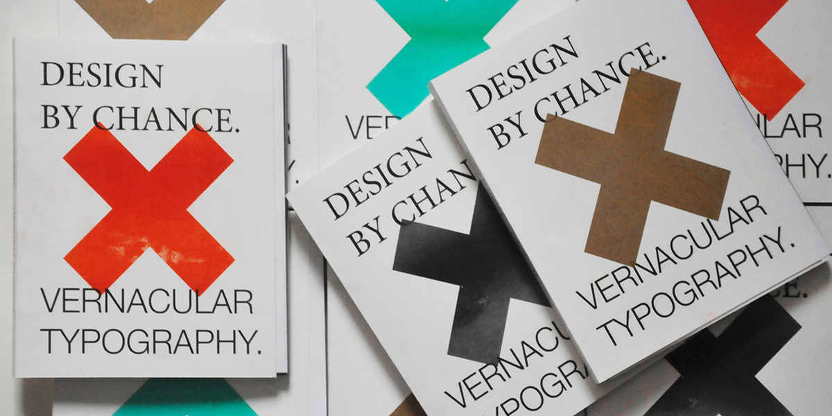
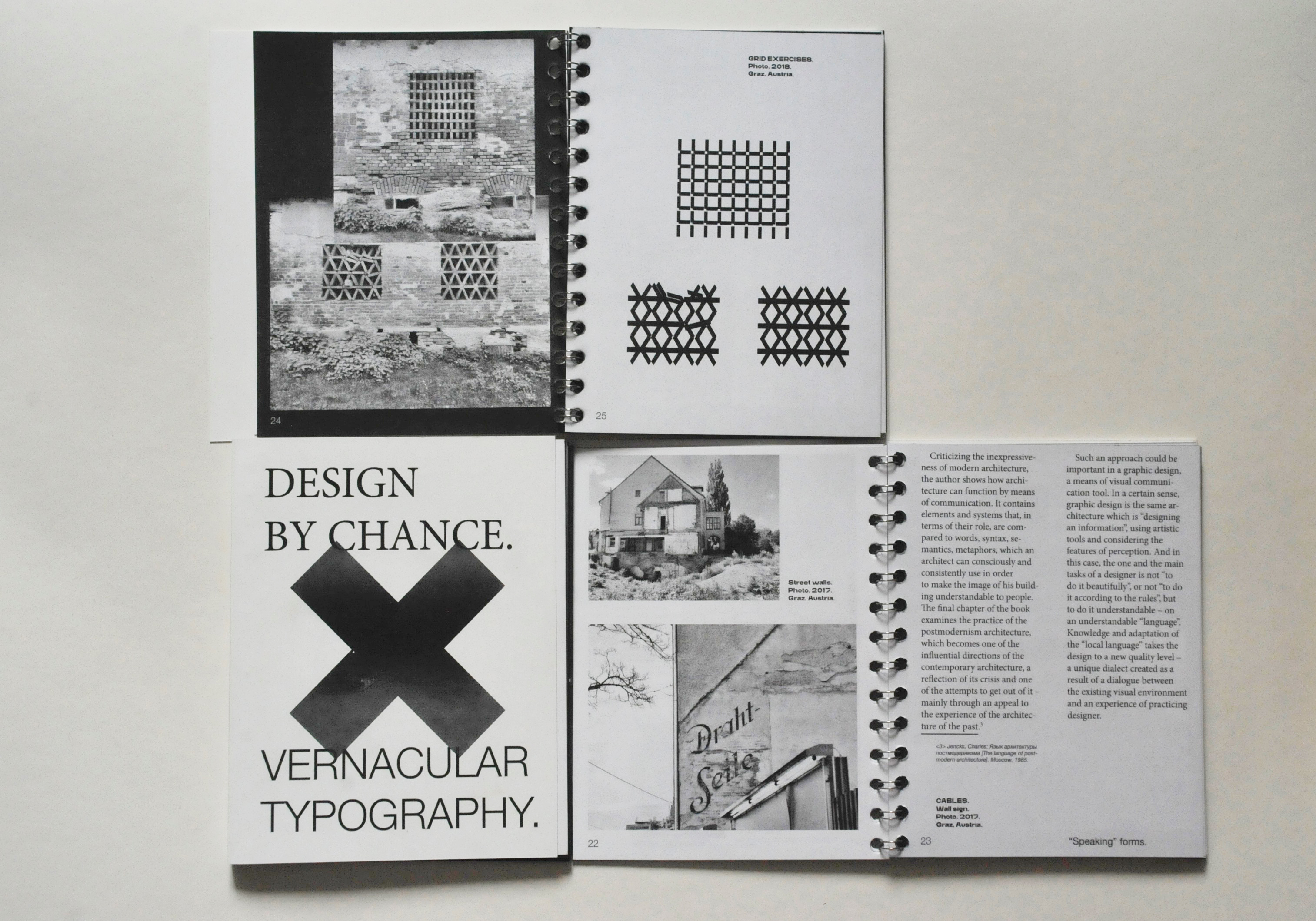
This master’s thesis searches for local Austrian examples of vernacular design, and compares them with international dialectics. Dedicated to local street typography, this thesis advertises Graz as a city with specific possibilities and approaches. This project should not be seen as a critique of Swiss typography or Helvetica fans. It is merely an essay about beauty and kitsch, an ode to inventive amateurism, an honest offensiveness and clumsy straightforwardness. While others may fight for a clear and sterile environment, the intention here is to find and emphasize colorful and contradictory examples for the creation of a local design language.


